Documentation
Getting Started
- Your First Website
FAQ
Make your Site Responsive
Your design is flexible but not responsive. Our goal is to display a different number of element depending of our viewport size (mobile, tablet, desktop). Let's fix this!
Make your Header Responsive
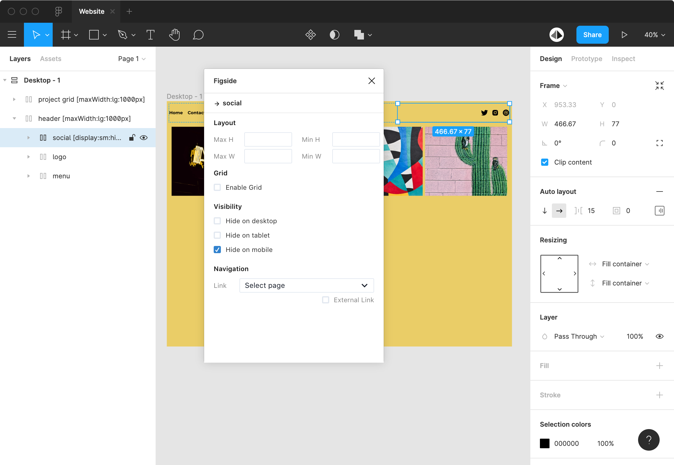
In mobile, we gonna hide the social links and display a smallest logo in the left. To add these behaviours you need to use the Figside plugin.
Select the frame that contains your social links and select Hide on mobile:
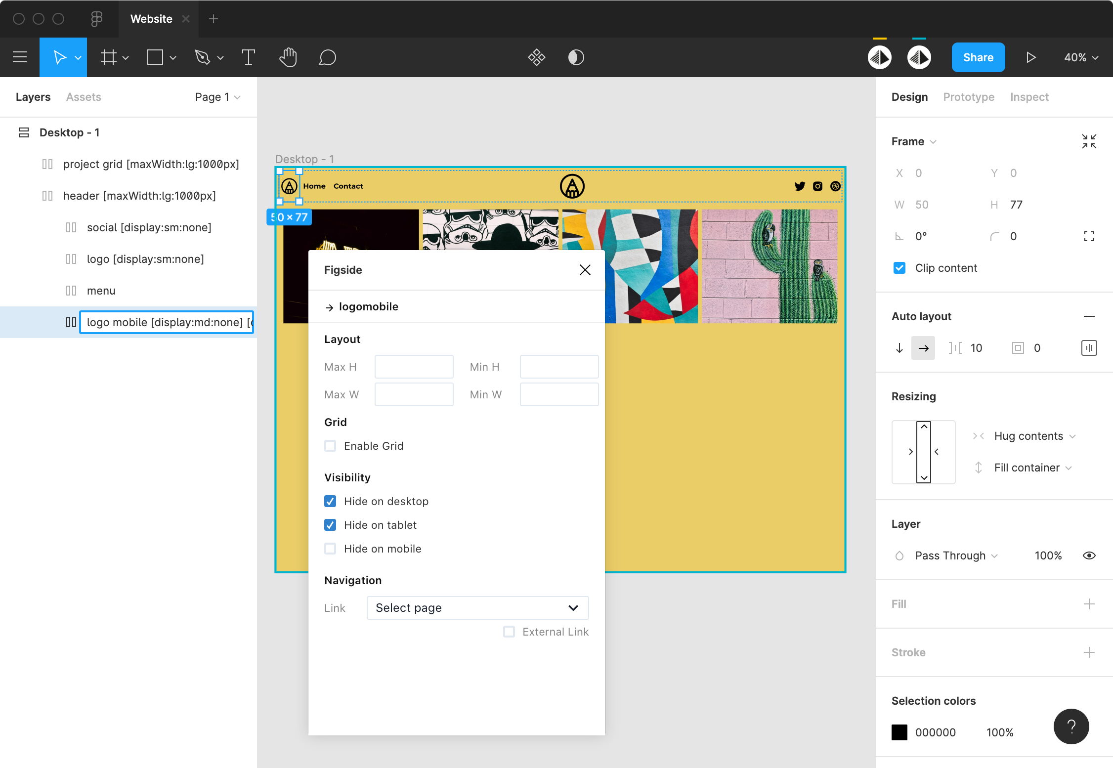
Duplicate your logo frame, rename it on logo mobile, set width on Hug contents and height on Fill container and move it on the left of your header.
Then display the logo only on mobile by clicking on the Hide on desktop and Hide on tablet checkboxes:
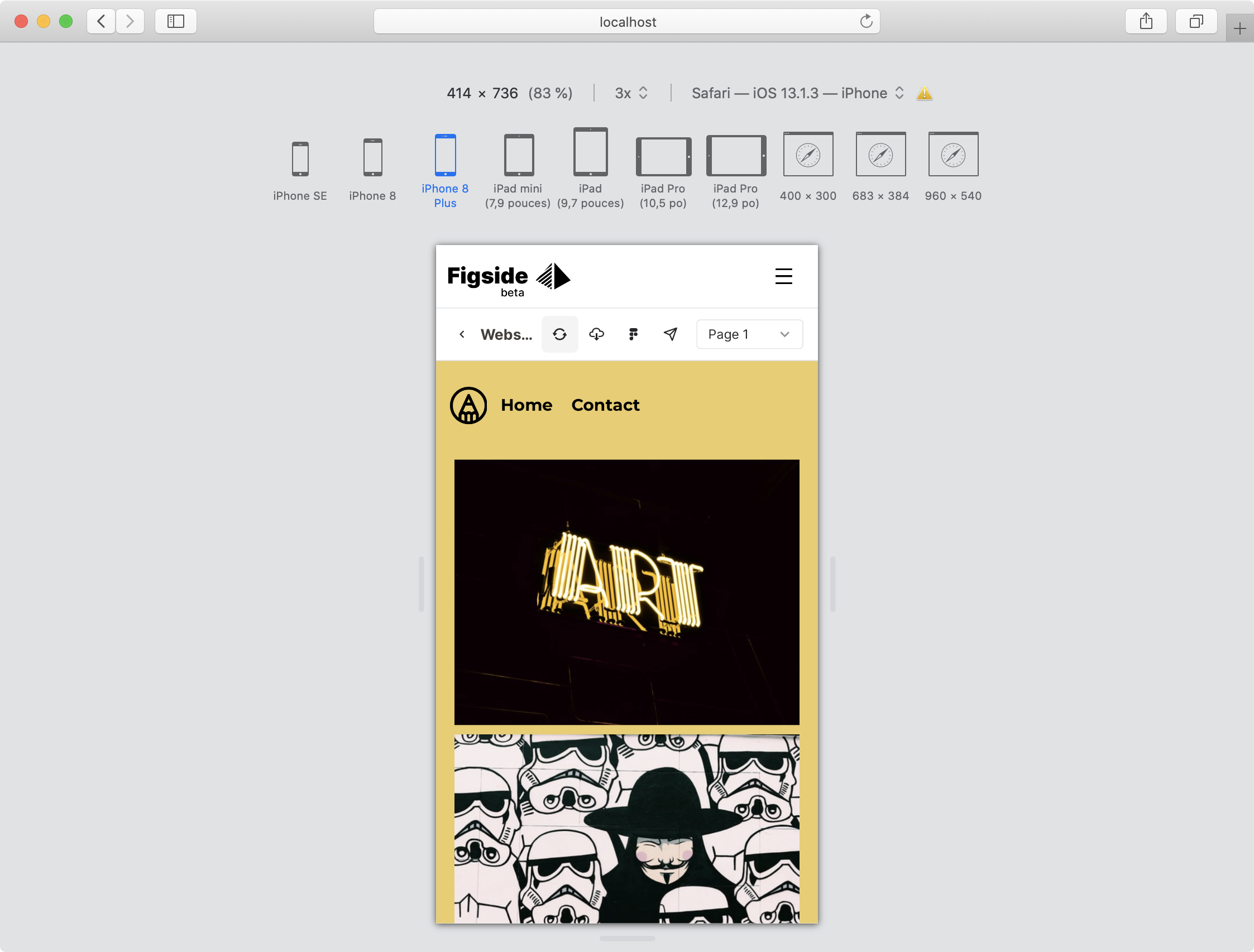
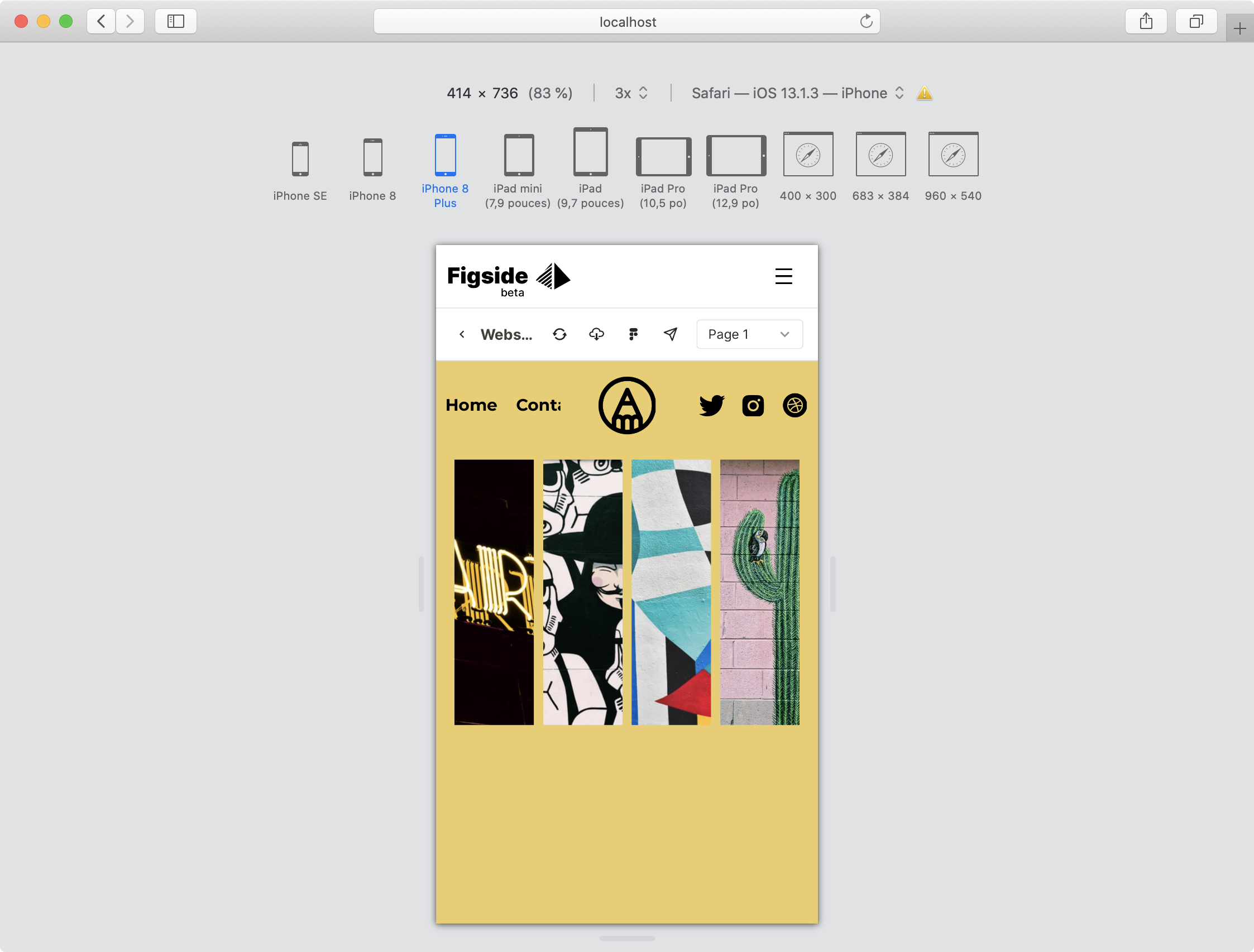
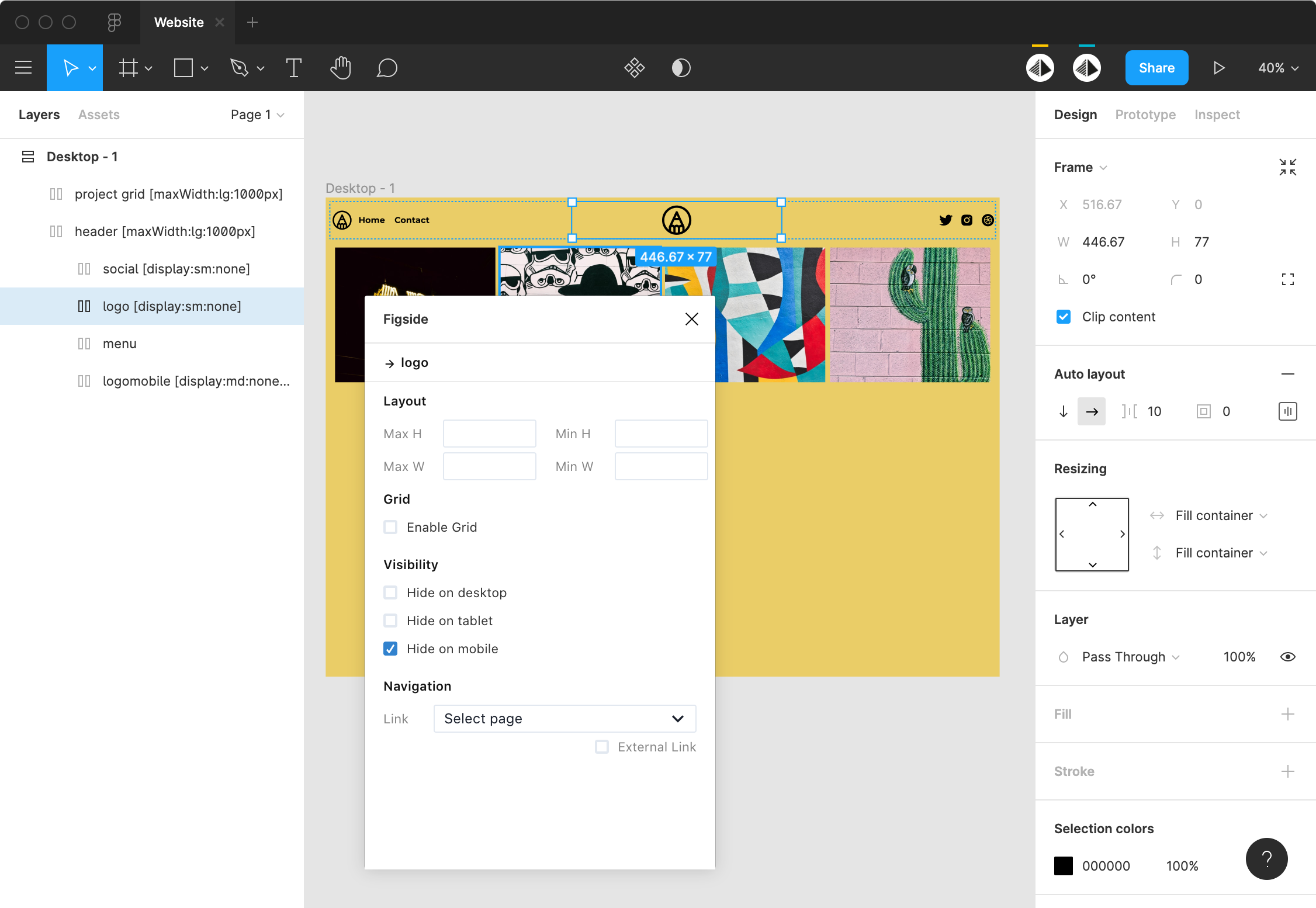
To achieve your header, hide the main logo on mobile and your are ready to go!
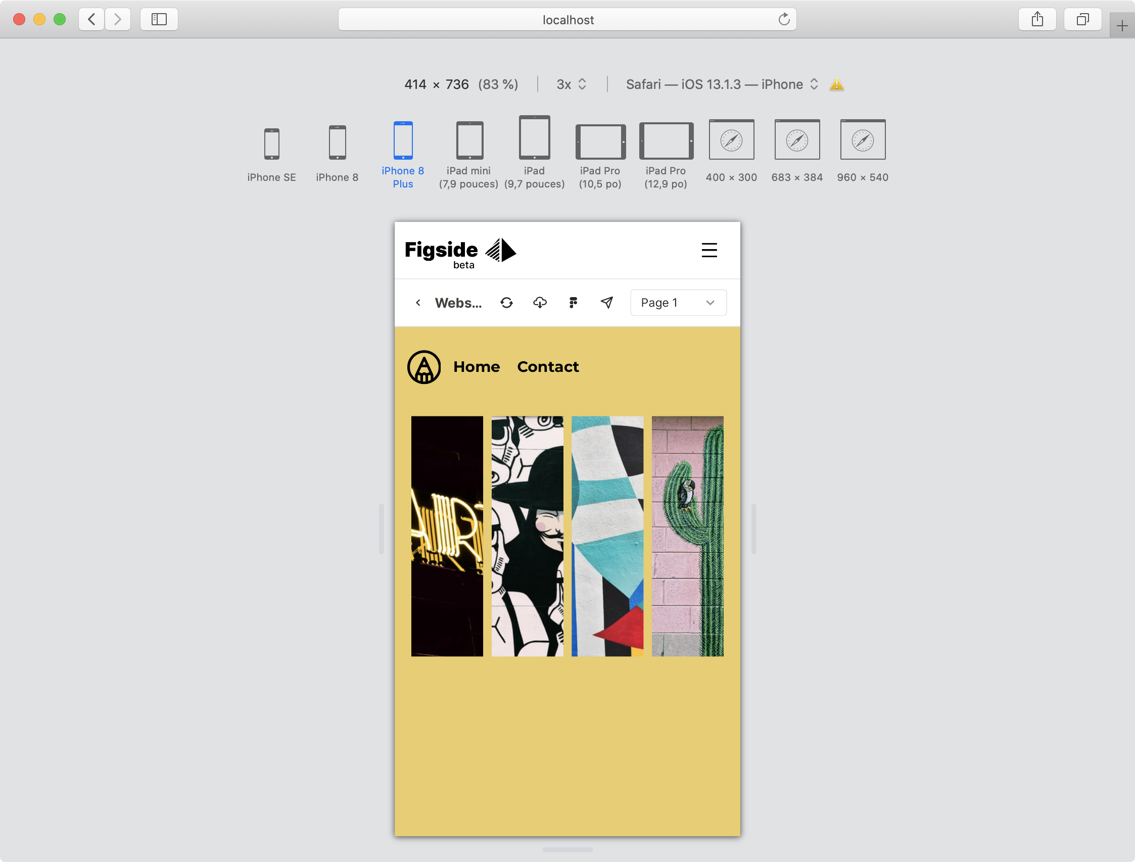
Check the result under Figside:
Let's make your grid responsive!
Make your Grid Responsive
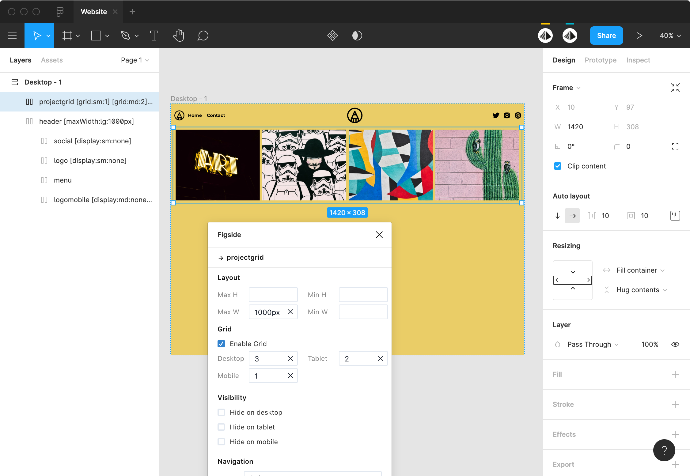
Thanks to the Figside plugin, it's quiet simple to make your grid responsive. Select your grid then select the Enable Grid option.
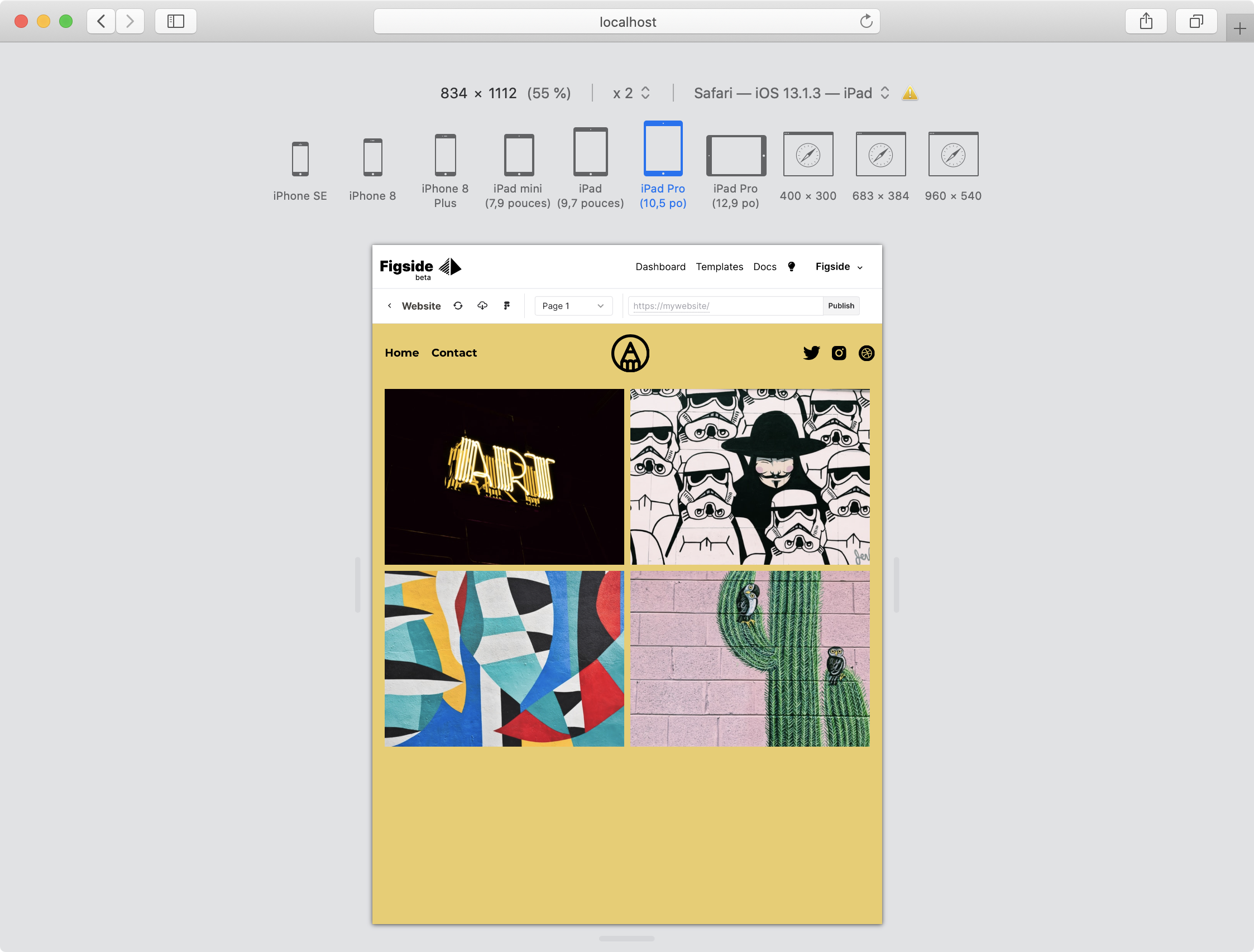
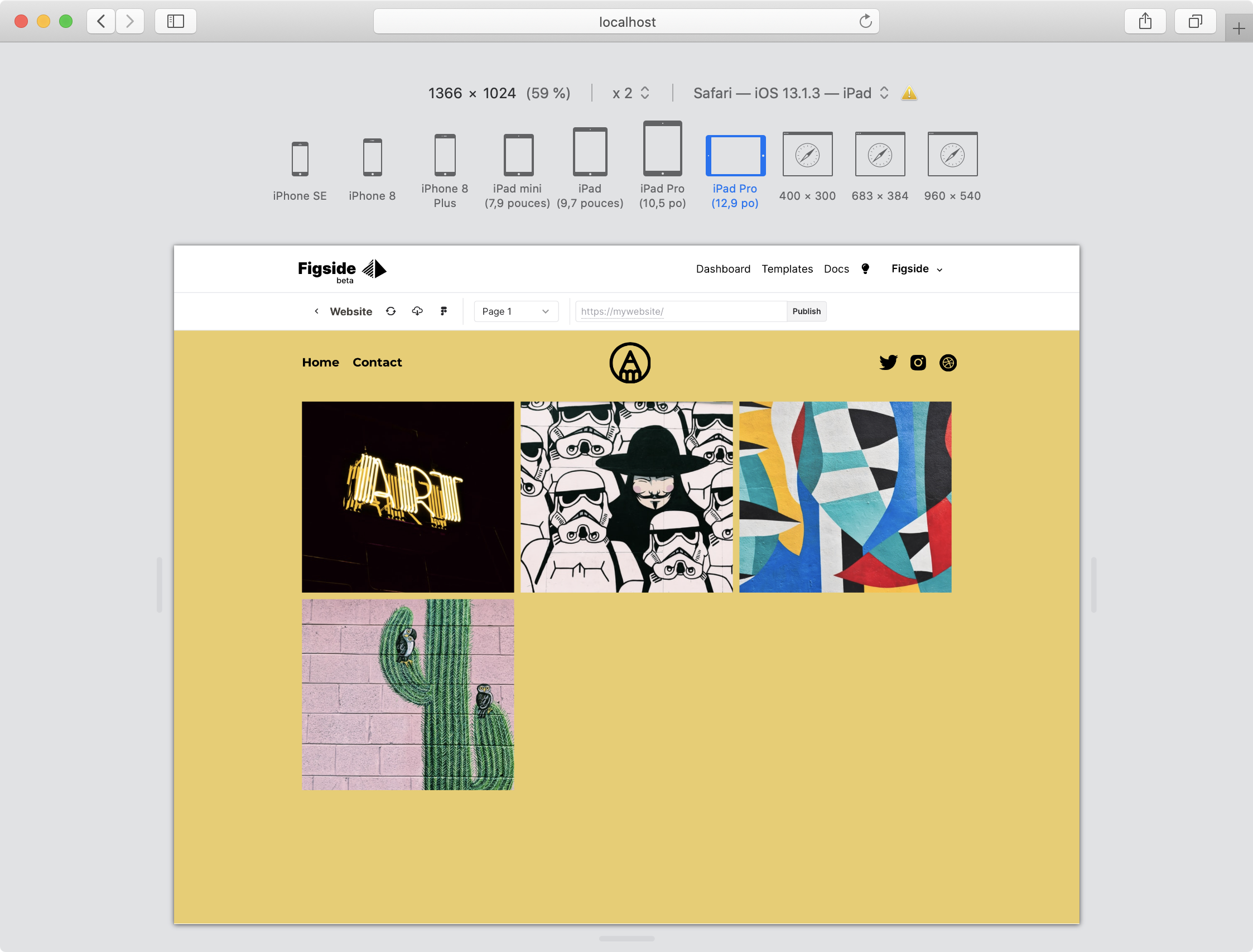
For each breakpoint set the number of items that you want to display per line. In our example we want: 3 items on Deskop, 2 on Tablet and 1 on Mobile:
Check in Figside: you are good!